LINES OF SIGHT
A NEW WAY OF LOOKING AT THE MONA LISA IN THE 21ST CENTURY
All the ideas and theories presented in this article are original to the author and have not, to the best of the author’s knowledge, appeared anywhere in any published form before the release date of this article.
The Mona Lisa is one of the most recognisable images of the 20th century and with this kind of notoriety comes a lot of distorted perspectives, both literally and figuratively, in relation to general truths regarding the work. The main aim of this article is to show in a fresh, new way, why the Mona Lisa is a unique, authentic masterpiece.

WHAT MOST PEOPLE DON’T SEE WHEN LOOKING AT THE MONA LISA
Tourists who visit the Louvre every year to see the Mona Lisa have no idea that they are missing something fundamental in the painting. Then they leave having failed to realise, that they have not really looked at the Mona Lisa in the way that Leonardo intended for her to be viewed.
Many questions arise in relation to the Mona Lisa. However, one element that is seldom, if ever mentioned, is the set of column bases that sit on the balcony edge that flank the model on either side. Though barely noticeable, these bases are a fundamental part of the composition of the painting. It is here we will start in order to explain what Leonardo was trying to achieve.
There have been a wide variety of theories put forward by experts over the years to explain why these columns are in the painting at all. These include claims that the bases were painted much later, they were painted by another painter, or the most popular theory that has been published by experts is that Leonardo had originally painted full columns either side of Lisa and then at a later date the painting was trimmed down. This latter theory, even though published by scholars/experts, has been proven to be wrong.
In 2004 there was a thorough scientific study carried out on the painting by 39 specialists. It was discovered that beneath the frame was a reserve area of framed wood. It revealed that at no point had the original painted edge been trimmed thus concluding once and for all the painting was never cut down and never contained columns.
SO WHY DID LEONARDO INCLUDE THESE COLUMN BASES?
To fully understand why Leonardo included these column bases it is necessary to firstly, quickly explain, one-point perspective in art.
In a nutshell, perspective is how three dimensional objects are represented on a two dimensional surface in relation to each other. To draw objects in one-point perspective you need a vanishing point. A vanishing point always sits on the horizon line. (An exception to this rule is if the topography of the landscape that an object is sitting on is not flat). The orthogonal lines of the objects all recede to this vanishing point to create a scene in one-point perspective. The following illustration is an example of this. See fig. 1
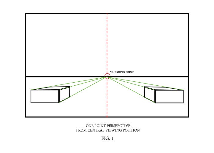
It is important to note that in fig. 1 the vanishing point is placed direct centre between the two objects. This gives the viewer the correct position to view the image from, in this case a vertical line through the dead centre of the picture plane.
If the vanishing point is off centre to the right or left, the objects now become asymmetrical and the side of the object on the right can be seen more than the side of the object on the left. See fig. 2

Once you have a vanishing point you then have the optimum viewing position that the artist intended a painting to be viewed from. Two great examples of one point perspective with a central viewing point are Leonardo’s “ The Last Supper” and Raphael’s “The School of Athens”.
In the School of Athens the lines of perspective converge directly between Plato and Aristotle. See fig. 3.

In the Last Supper the lines of perspective converge on Jesus’ head. See fig. 4.
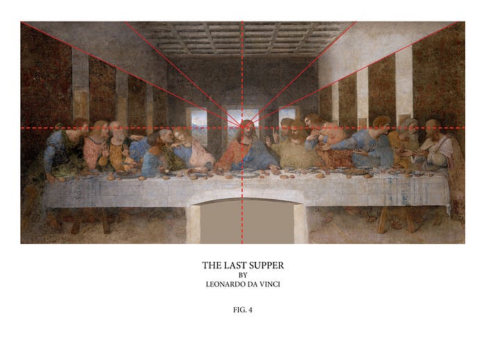
Both these paintings are to be viewed directly from the centre. It is this knowledge of perspective that is integral to understanding the true function of the column bases in the Mona Lisa.
The column bases in the Mona Lisa are asymmetrical in order to help guide you into the correct viewing position, left of centre, just as shown in fig 2. The reason for this is that Lisa’s head and body are not facing us head-on but instead, turned away to her right at an angle. This is known as the three quarter pose. It was Leonardo’s intention to pull the viewer away from the centre of the painting, so as to be in direct alignment with Lisa’s eyes. It is the eyes (both eyes together) that are the main focal point of the painting and Leonardo does everything possible to make us aware of this.
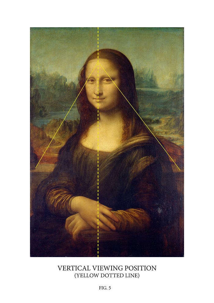
To find this correct viewing point position we need to locate the vanishing point. To do this we simply continue out the perspectives of the bases to where they meet on Lisa’s forehead. By drawing a vertical line from top to bottom through this vanishing point we now have the vertical viewing position that was intended for this painting, which is left of centre.
The Mona Lisa was never meant to be viewed from a central position but rather from left of centre, in order to have the viewer look directly at Lisa and connect with her. The bases are composed in such a way as to facilitate this happening. See fig 5.
WHERE IS THE HORIZON LINE?
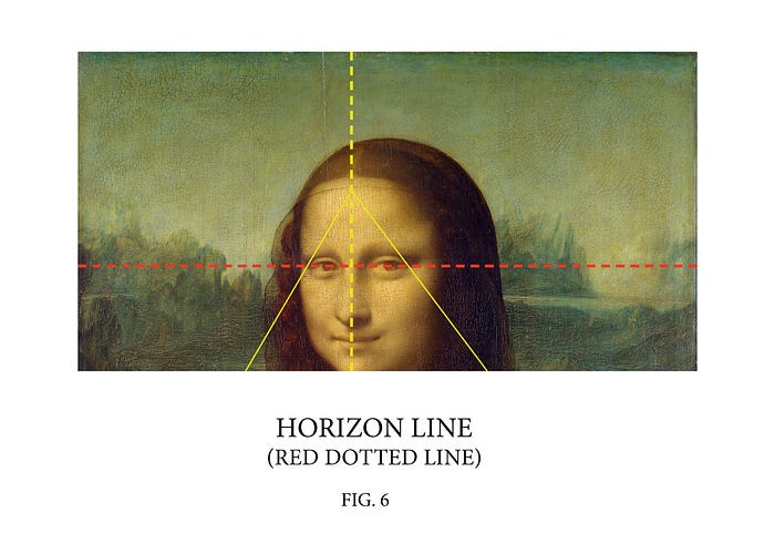
Now that we have a vanishing point, we should be able to work out the position of the horizon line. As stated earlier, a vanishing point always sits on the horizon line. We now run into a problem, as our vanishing point on Lisa’s forehead seems much too high a position for a viable horizon line. A horizon line here would throw the picture off balance.
Many people mistakingly think that the horizon line is where the lakes over Lisa’s shoulders meets the base of the mountains. The problem with this, is that horizon lines are horizontal (as it says in the name) and the lakes here are not, but rather they slope up at an angles. In-fact the only element that could be considered horizontal in this painting is the eyes from the outer corner of the right eye, to the outer corner of the left. There is no other element in this painting that runs horizontal.
Even the balcony ledge on close examination seems to bend up at either side. We will discuss the possible reason for this later on. Even though there seems to be no definite horizon, we can however estimate where Leonardo intended the horizon line to be. We know that mountain outlines are not the horizon line and we know that the lakes are not the horizon line because of how they slope up at an angle.
From this we can ascertain that the horizon line falls somewhere below the mountain outline and above the lakes. The most obvious place would be in alignment with Lisa’s eye level so we will now assume that is where Leonardo intended it to be. By obscuring the horizon line behind the mountains there is nothing to distract our attention away from the eyes. See fig. 6
Now that we have established the horizon line as being at Lisa’s eye level, it is obvious to see, that the perspectives of the column bases intersect the horizon at the outside corners of Lisa’s right and left eyes. This means we now have two vanishing points. This is not a mistake. This is a device used by Leonardo to make her eyes the focal point of the piece. See fig. 7.
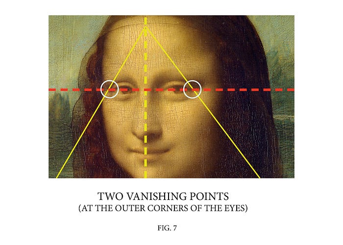
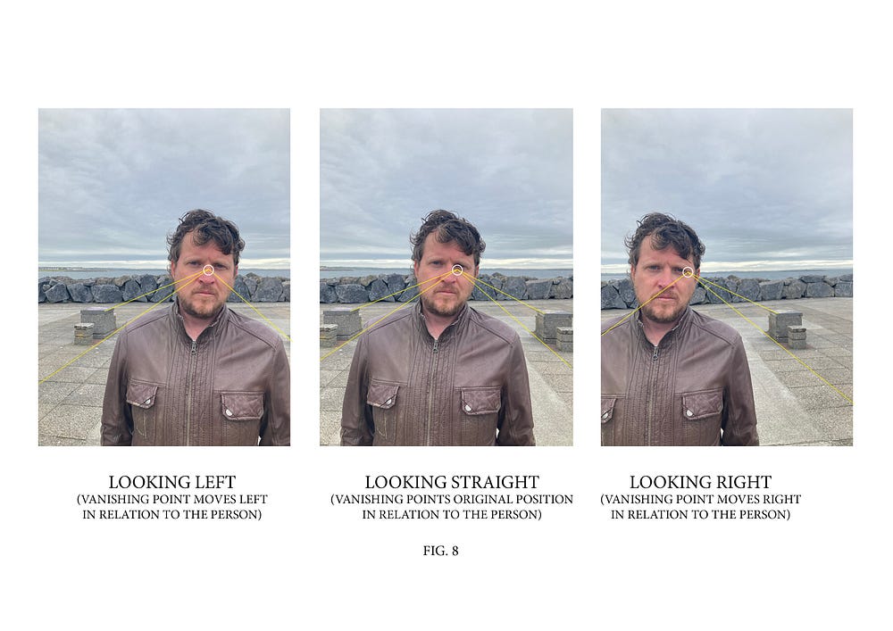
In-fact there are not really two vanishing points. They are actually the same vanishing point. A vanishing point seems to change position in relation to a forground object, depending on if you are looking right or left out over the landscape. Leonardo was trying to create reality as our eye sees it so this would explain why these elements of the painting are composed in this way.The following is a real world example that explains how this works. See fig. 8
THE BACKGROUND
The most interesting thing about the background of the Mona Lisa in terms of composition is how it is staggered. It seems to meander, twisting and turning in all directions. There are no parts of the landscape that run horizontally across the painting. It has its own foreground, middle ground and background.
A common question often asked is “why the landscape to the right side of Lisa’s head is at a different level than that to her left?” The simple answer is that the mountains to Lisa’s right slope up towards the horizon from middle ground to background. This creates an interesting dynamic throughout the painting.
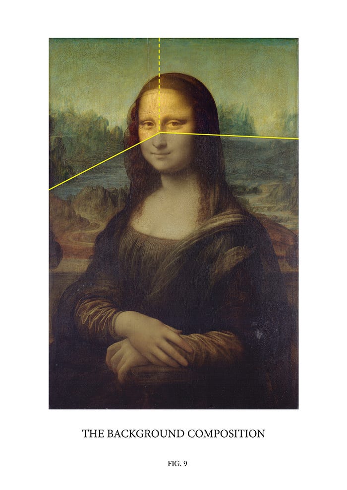
The background, just like the column bases, is composed in such a way as to pull your view into alignment with Lisa’s eyes. There is a real sense that the distant mountains on the right hand side of the painting (over Lisa’s left shoulder) stretch across behind Lisa’s head, to the vertical line, left of centre that we discussed earlier. The mountains that stretch up to the horizon line on the left of the painting (to Lisa’s right side) give the impression that they meet the horizon behind Lisa’s head, again at this vertical line, left of centre.
If we imagine the background landscape as a stage set with the most distant mountains as the back wall of the stage and the mountains to Lisa’s right as one of the side walls of the set, then where the side and back wall meet is the vertical viewing line left of centre. In this way the background is composed to pull you towards Lisa’s eyes. See fig. 9
THE BALCONY LEDGE
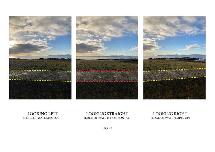
An element that is completely unique to the original Louvre Mona Lisa is the balcony ledge. Out of all the existing copies that contain balconies, the thing that sets the Louvre version apart is how it is painted. The balconies in all the other versions are painted horizontal whereas the edge of the Louvre Mona Lisa’s balcony ledge is slightly bowed. It angles up to a small degree at either side of Lisa’s torso. See fig. 10
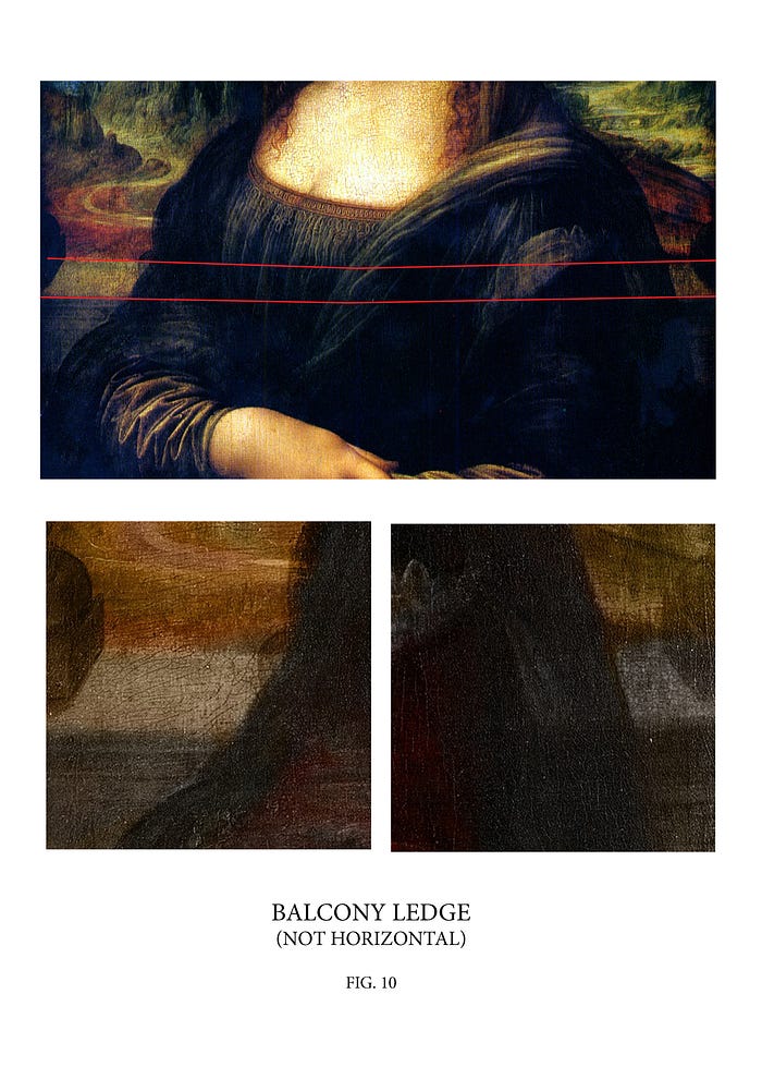
A possible reason for the ledge to be painted in this manner is to create a panoramic relationship with the landscape and to create an added degree of realism for the viewer if looking left, right or straight on while viewing the painting. The best way to explain this is to describe a simple experiment that anyone can do with a camera/camera phone.
Firstly, find a wall that has a panoramic landscape behind it. Hold up the camera phone to the landscape making sure the bottom of the screen is parallel to the wall and take a photo. Then turn the camera, just as you would turn your head to the left and right at an angle anywhere between 30 and 45 degrees and take two photos. You will notice that the edge of the wall in the right and left photos rise up at an angle. This is surely the effect that Leonardo was trying to achieve in order to capture three dimensional reality. See fig. 11
GOLDEN RATIO. FACT OR FICTION?
It is highly debated whether artists of the Renaissance used golden ratio in their creations. Golden ratio or divine proportion is 1:1.618. Leonardo in particular seems to be connected in popular culture with this ratio. It is not my intention here to state definitively whether the use of golden ratio in Leonardo’s work is a truth or a falsehood. However, I will present some facts in relation to the Mona Lisa and the possible use of Golden ratio in the work that seem to correlate with the contents of this article thus far.
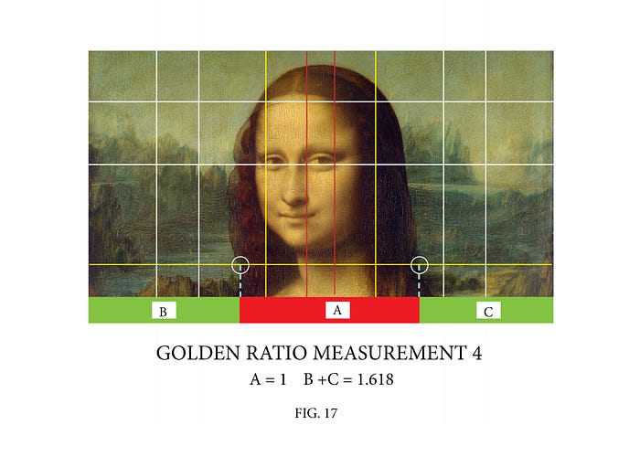
In order to create a golden ratio grid on a surface you need to divide both the horizontal and vertical length by 1.618. This gives you one set of Golden ratio lines. When you divide your answer again by 1.618 you get another set of lines.These primary divisions are the yellow lines in the diagram below. You can then subdivide these into smaller secondary golden ratio divisions. These are the white lines in the diagram. The red lines are when you divide the horizontal of the central box up again by 1. 618. See fig. 12
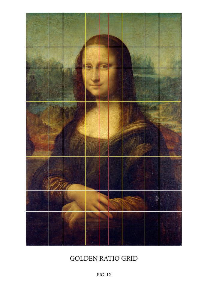
It is immediately apparent that the column bases sit on the bottom, horizontal, Yellow, primary, golden ratio line. One of the upper horizontal, white, secondary, golden ratio lines falls exactly where we said the horizon line would be in fig. 6.
The second thing to notice is the the left primary, yellow, vertical, golden ratio line and the red right, central, golden ratio line both run through this horizon line at the exact points that we located the two vanishing points at the outer corners of Lisa’s eyes in Fig. 7.
So what does this mean?
It means that Lisa’s eyes are positioned as part of the golden ratio in relation to other parts of the painting, more than once.
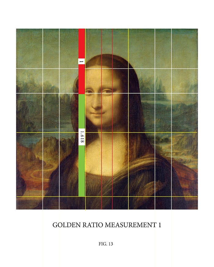
For example the vertical distance from the top of the painting to the corners of her eyes and then to the column bases is 1:1.618. See Fig. 13
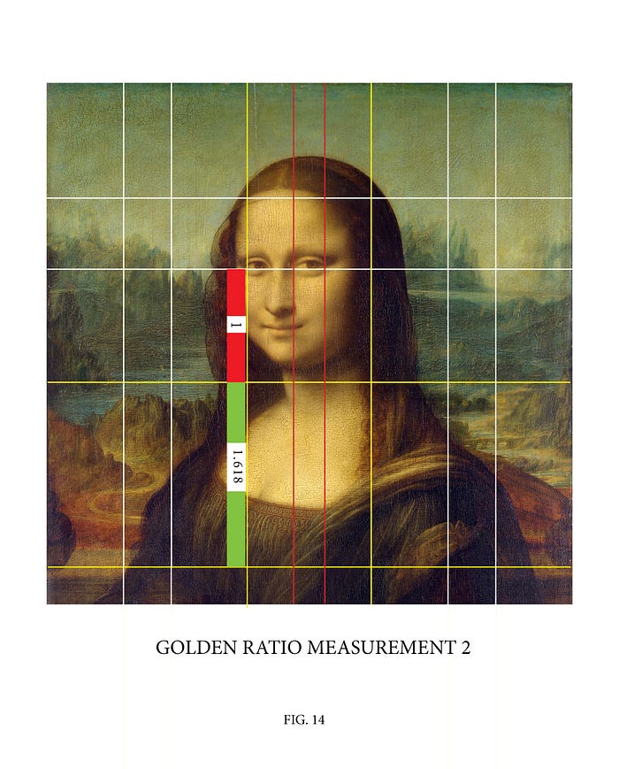
The vertical distance from her eyes to where the background meets the middle ground and then to the base columns is 1:1.618. See fig. 14
The Horizontal distance from the left hand side of the painting to her left eye and then on to the right edge of the painting is 1:1.618. See fig. 15.

The horizontal distance from the outer corner of her left eye to the inner corner and then on to the outer corner of her right eye is 1:1.618. See fig. 16.

The most interesting example however are the points where the right and left side of her veil intersect the lower, horizontal, primary, yellow, golden ratio line. If this distance is taken to be 1, then the measurements either side of her head from these points to the edges of the painting added together is 1.618. See fig.17.
The most important thing to note here is that the internet is full of images of the Mona Lisa with superimposed golden ratio measurements that seem to be made up out of thin air with no foundation whatsoever. The difference with the measurements shown here is that they are all based on the same underlying golden ratio grid system.
As it stands there is no historical account by Renaissance artists stating whether golden ratio was used in their work, however, this is not a reason to refute the idea. There are many times in history that things were done that are not quiet clear to the modern world and so understanding gets lost in the sands of time. In these cases it is best if an individual makes up their own mind.
CONCLUSION
It has taken over five centuries for the Mona Lisa to gain the reputation that she has today as the world’s most famous painting. Some would say that the Mona Lisa is undeserving of this title. Sometimes in our culture, when we are overexposed to something we tend not to see it any more.
I hope this article has facilitated an understanding of how to see the Mona Lisa in a fresh new way and at the same time shed light on how a master painter creates a work of art. To really understand why something is a masterpiece, it is fundamental to know how it was created in order to look at it and really see it.
